Hit the one in the middle
The search for the center....
Thursday, March 17, 2011
Medicare Coverage by County
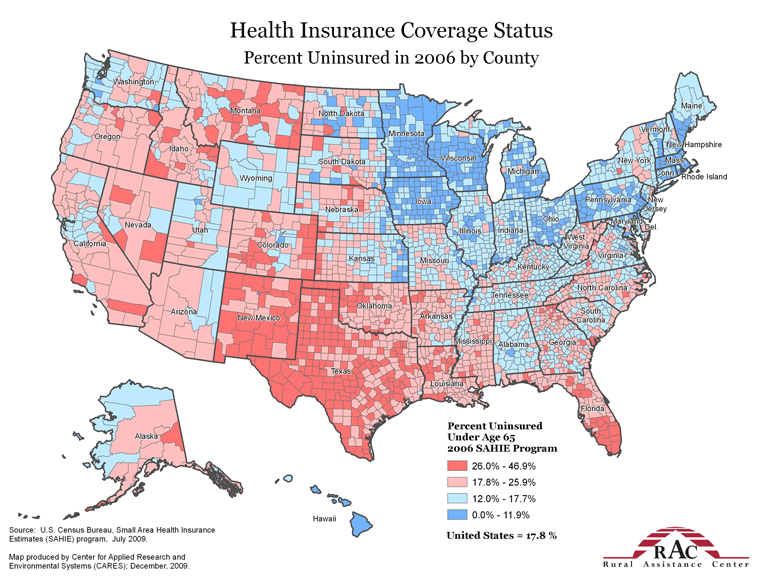
This a terrific map from the Healthcare Economist blog. It breaks down the percent of people uninsured by county as of 2006. The difference between red and blue states (both politically and on this graphic) is pretty striking.
More cool maps here:
http://healthcare-economist.com/2011/03/17/healthcare-maps-from-rac/#more-4945
No comments:
Post a Comment
Newer Post
Older Post
Home
Subscribe to:
Post Comments (Atom)
No comments:
Post a Comment